Genomix is an educational platform that delivers interactive bioscience workshops to kids aged 7-15. By making science easy and fun, Genomix hopes to motivate young students to pursue opportunities in STEM.
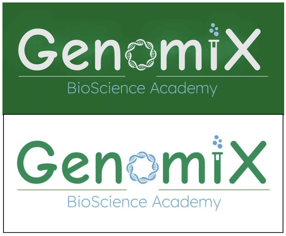
A client approached me with a DIY logo that, in addition to using Comic Sans, had several issues—poor legibility, unnecessary complexity, and a lack of coherence.
After the discovery call, I began researching the client's profile, target market, and competitors. Together, we discussed our key objectives and formulated the brand’s core message. Eventually, our initial concept was transformed into a cohesive brand identity.
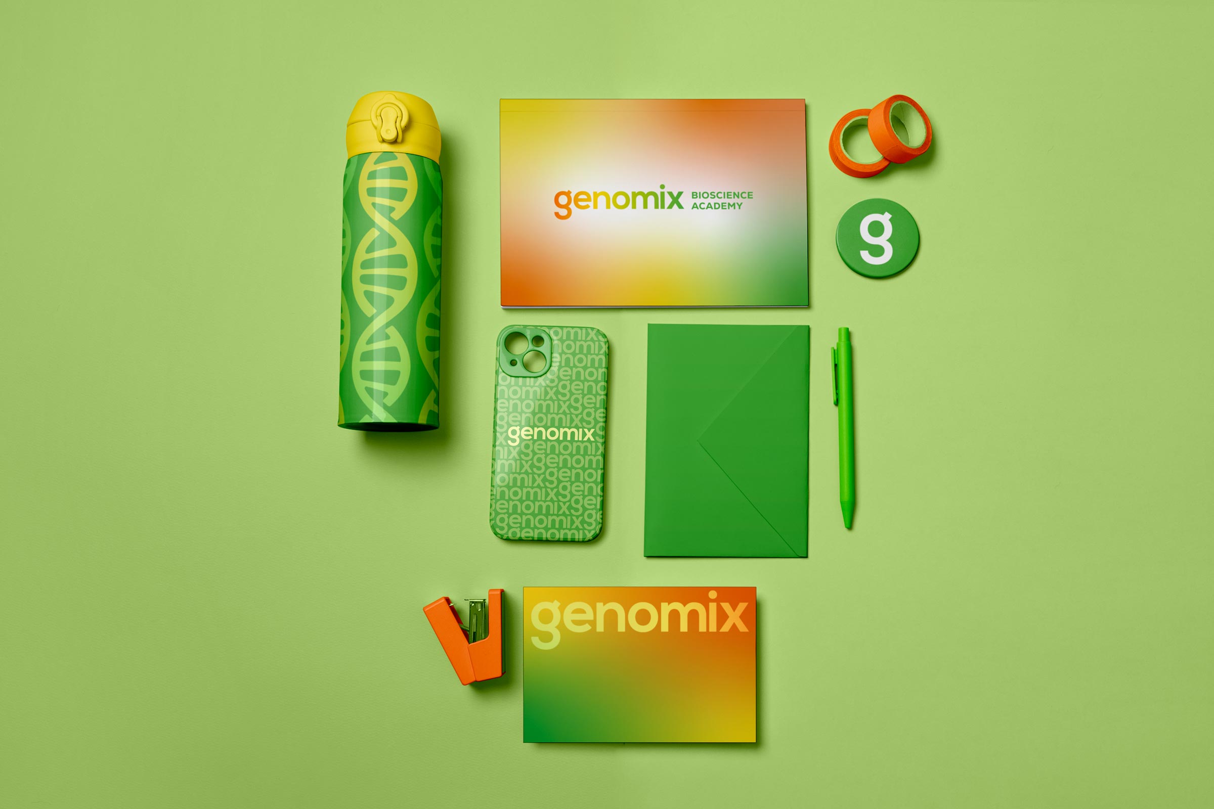
Green was an important colour for the client, and we chose to keep it, as it aligned well with the brand—symbolising biosciences, nature, growth, and prosperity. Following research, I suggested incorporating additional colours through gradients. Their vibrancy symbolised the joy found in the learning process and are inspired by the multitude of colours seen in lab experiments. They also reinforce the brand’s core message: science can be fun and exciting!
DNA was a must-have for the client, and after a few sketches and tweaks, I created an icon that fit well—bonus points for resembling a candy, which aligns nicely with our child-focused audience!