Justina's Bouquets
Justina's Bouquets
UX/UI DESIGN
Justina’s Bouquets is an app that delivers fresh and beautifully crafted flower bouquets to the door.
Justina’s Bouquets is an app that delivers fresh and beautifully crafted flower bouquets to the door.
Justina’s Bouquets is an app that delivers fresh and beautifully crafted flower bouquets to the door.
Concept: This is a personal project created to explore user experience and interface design. The idea came from my home country’s flower market, where florist shops are extremely popular and profitable. Ordering flower delivery home is a common way to congratulate friends and family members with any occasion. Despite the abundance of flower delivery apps in online stores and their good intentions, I found that most of them offer an awkward user experience. I didn't enjoy using any of them and wished there was at least one simple, easy-to-use flower delivery app where I could place all my orders all year round.
Task: To create a flower delivery app with a seamless user experience for an imaginary client, Justina. She owns a popular florist store network with a loyal customer base. She wants to create an app for her customers to simplify and expedite their purchasing experience and to reach out to customers who prefer to shop online rather than in-store. She believes that creating an app will create a unique advantage for her business and make it more competitive.
Research: I started the research by analysing competitors and looking into other similar apps. I wanted to know what's best to avoid in my designs and what to include.
Usability testing: After sketching out a few ideas on paper, I made my low-fidelity wireframes in Figma. Initially, I didn’t plan to test them with users, as this was supposed to be a purely UI design project. However, after showing the project to my good friend and receiving some insightful feedback, I went ahead with the user research and showed the wireframes to three more participants.
Pain points
Users weren't able to find flowers for occasions such as Mother’s Day, Valentine’s Day, etc;
They wanted to see bouquet characteristics;
Some users wanted to personalise their flowers;
They wanted to see real people's reviews;
They also wanted their loyalty rewarded.
Pain points
Users weren't able to find flowers for occasions such as Mother’s Day, Valentine’s Day, etc;
They wanted to see bouquet characteristics;
Some users wanted to personalise their flowers;
They wanted to see real people's reviews;
They also wanted their loyalty rewarded.
Pain points
Users weren't able to find flowers for occasions such as Mother’s Day, Valentine’s Day, etc;
They wanted to see bouquet characteristics;
Some users wanted to personalise their flowers;
They wanted to see real people's reviews;
They also wanted their loyalty rewarded.
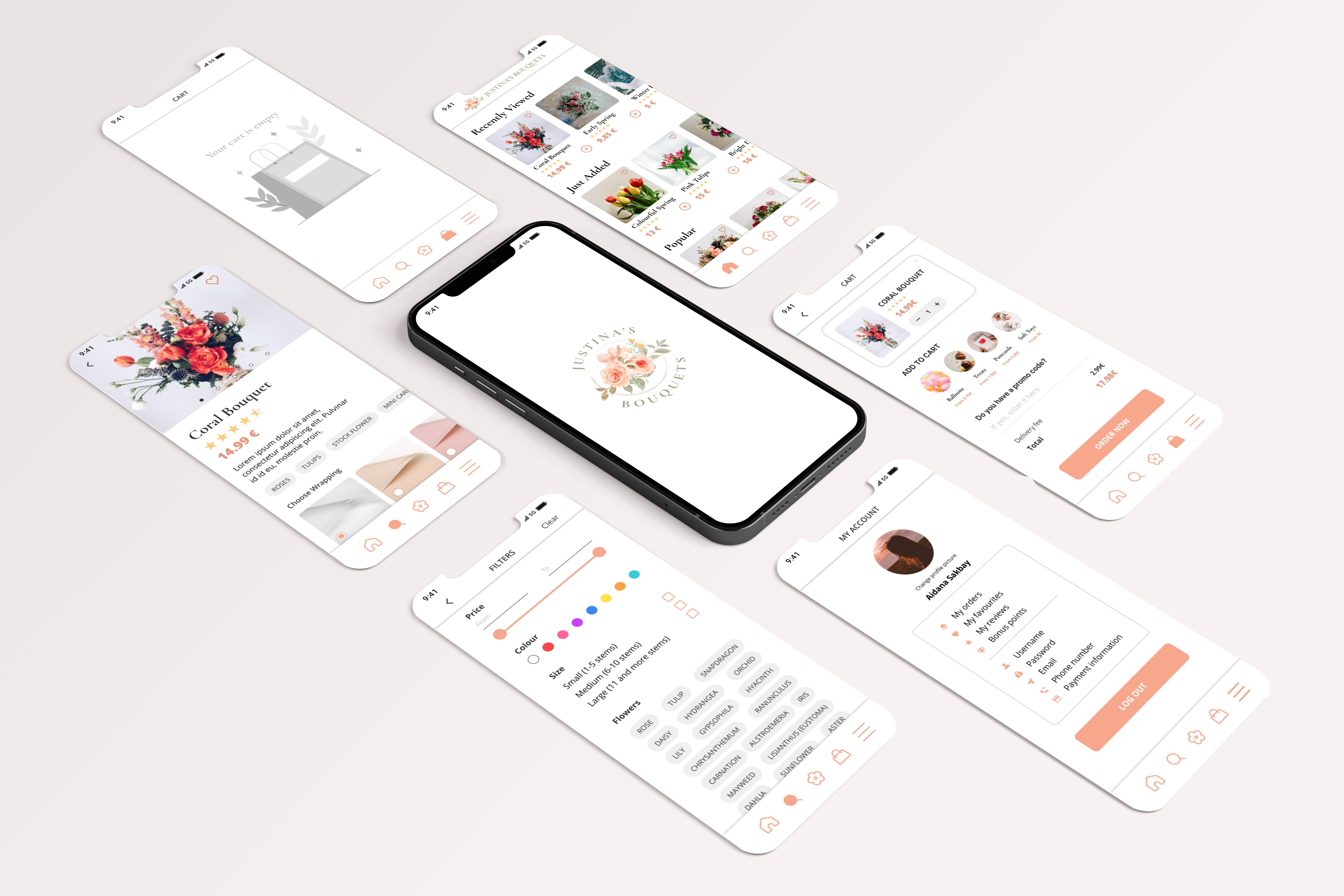
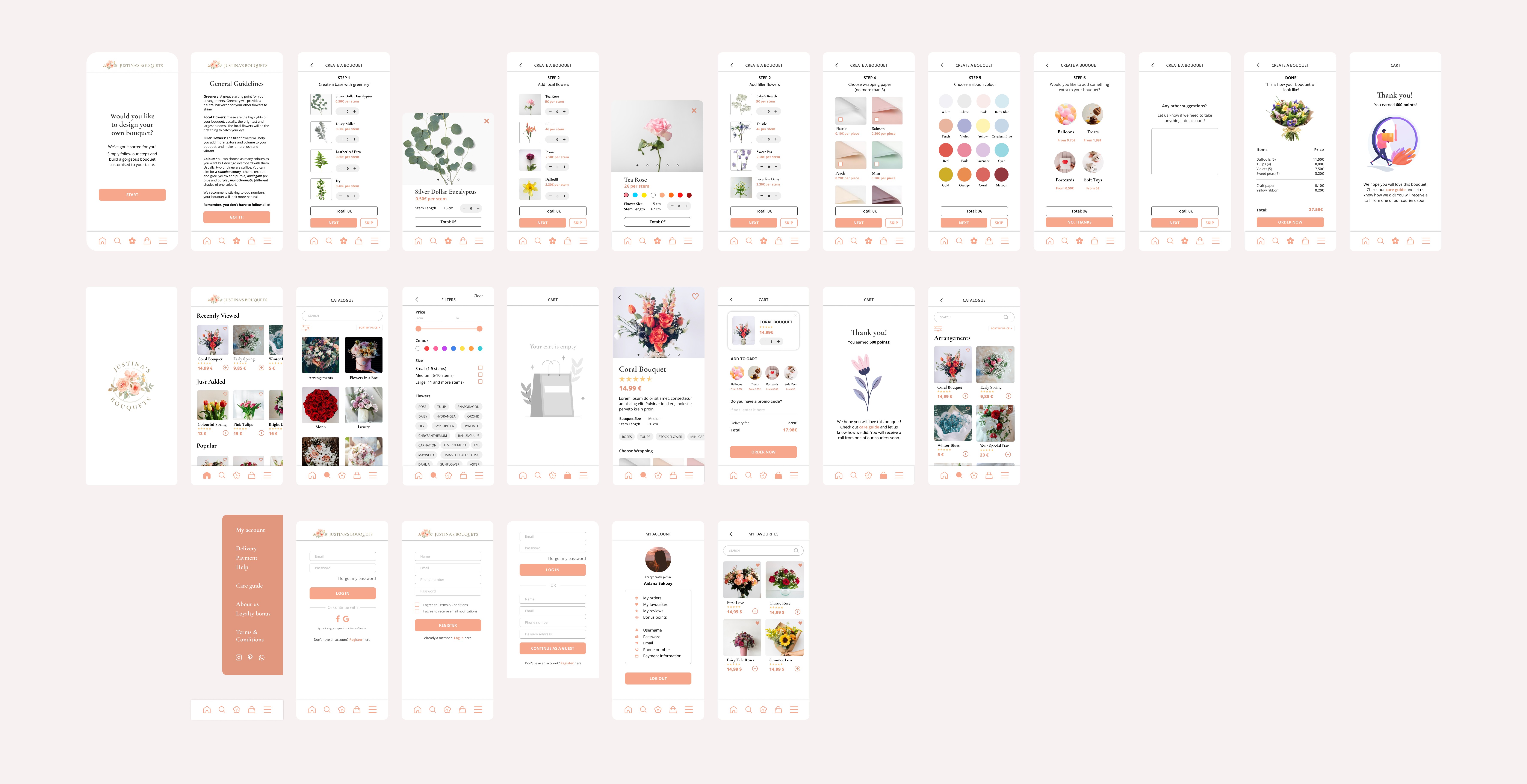
Solutions
I added an Occasion category to the menu, where users would be able to select bouquets for specific occasions;
I included information about the size and length of the flowers; and added tags with flower names to specify the composition of the bouquet;
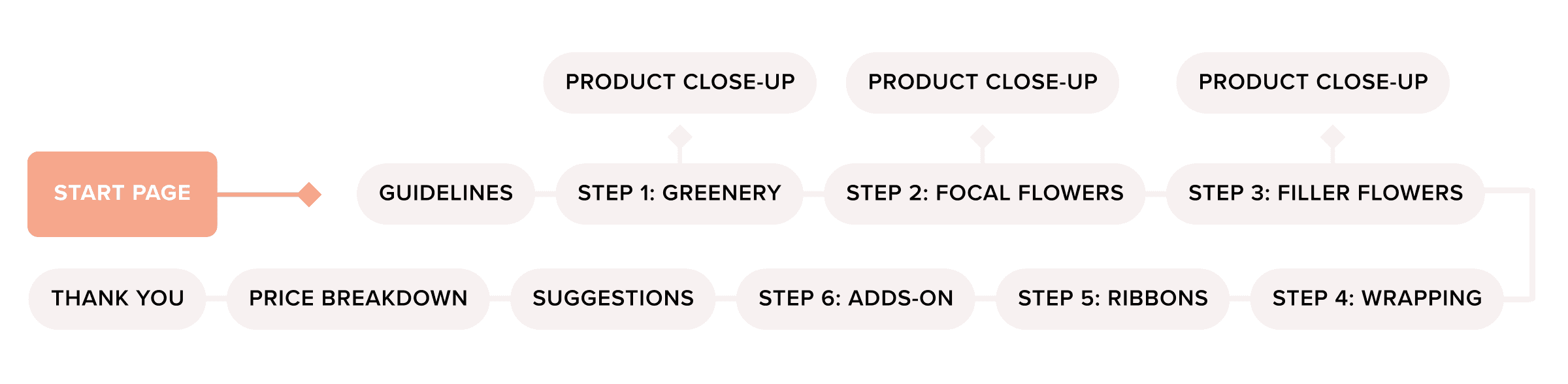
I created a new user flow where customers could create a completely personalised bouquet from scratch. I also added Wrapping options to the ready-made bouquets so that the users could customise them as well.
I added Reviews to the product review page and Loyalty page to the menu
Solutions
I added an Occasion category to the menu, where users would be able to select bouquets for specific occasions;
I included information about the size and length of the flowers; and added tags with flower names to specify the composition of the bouquet;
I created a new user flow where customers could create a completely personalised bouquet from scratch. I also added Wrapping options to the ready-made bouquets so that the users could customise them as well.
I added Reviews to the product review page and Loyalty page to the menu
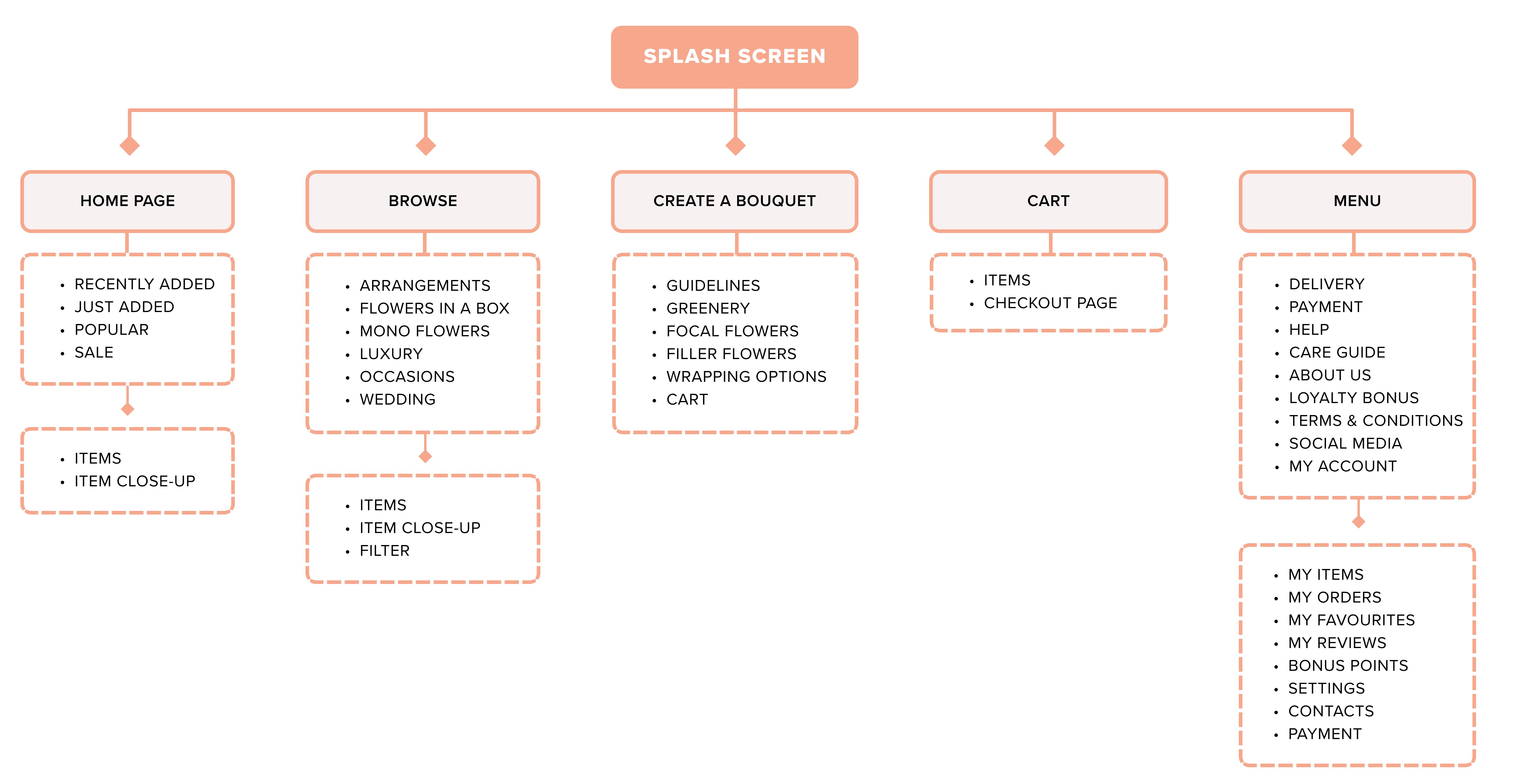
Changes: Before moving on to high-fidelity wireframes, I reviewed my information architecture and made a few research-based changes. All these changes were integrated into the high-fidelity wireframes. The biggest change was adding a completely new user flow for building customised bouquets. To create one, I have researched florist tips on creating a bouquet and implemented them in my user flow. I have also added general guidelines in the beginning to help guide the customer.
Design: The design style in this project was inspired by online luxury shopping platforms. Some icons were created by myself, and some were sourced from Figma plugins. I used stock illustrations with a free license from Freepik.com to create my logo (watercolour illustration by asrulaqroni) and my cart page.
Learning Conclusions: I underestimated the user research part of this project but I’m glad I decided to conduct it because it helped me to come up with some great and unique features that I haven’t seen in other apps. My favourite part was working on the UI design of this brand and app.